
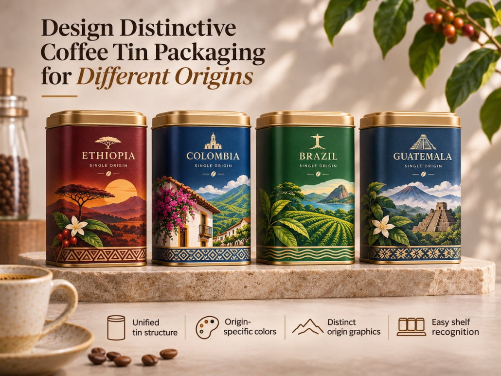
How can one design distinctive coffee tin packaging for coffees from different origins?
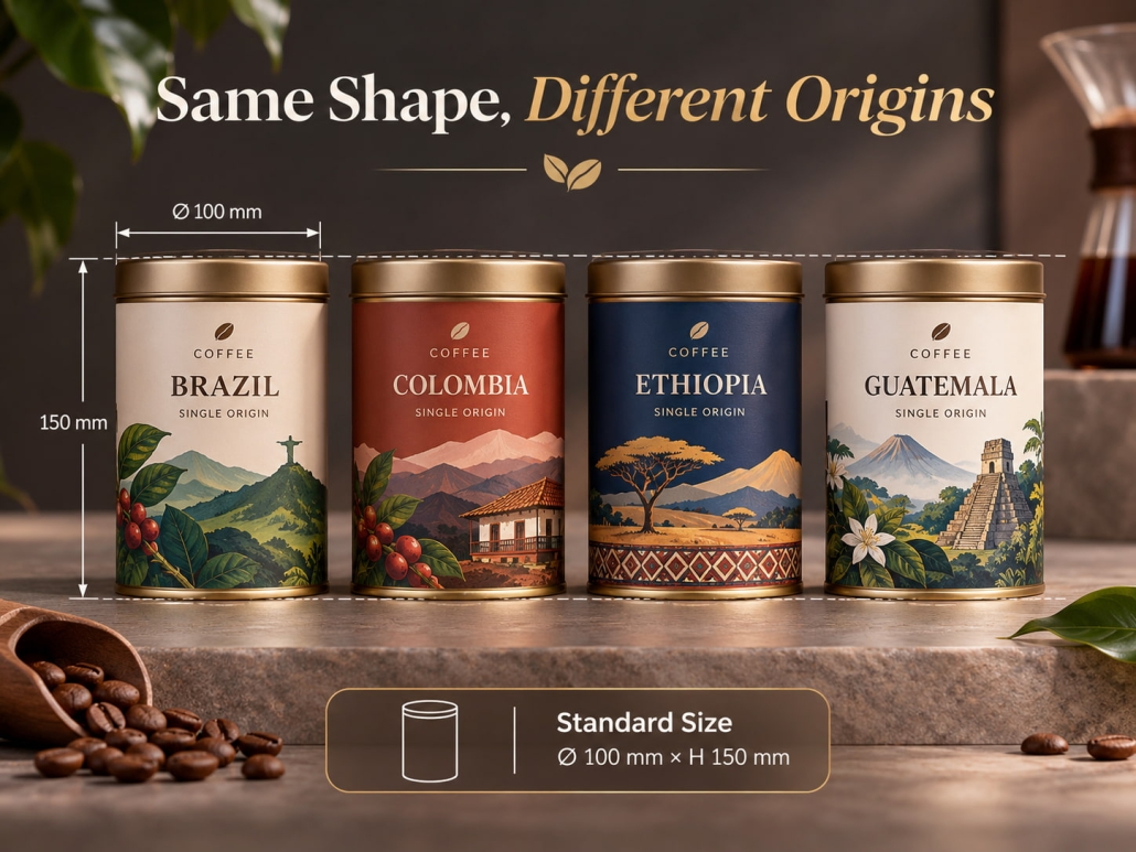
Brands that sell coffee beans from Ethiopia, Colombia, Brazil, and other origins face a design challenge: they need to ensure consumers can recognize the brand at a glance while also distinguishing coffees by origin without reading each label individually. The optimal solution is to create a unified, distinctive line of coffee tin packaging with the same container shape, consistent branding, and standardized production processes, while assigning each origin a unique color scheme, graphic design, and product information. This approach allows coffee brands to establish distinct product identities for each variety while ensuring the entire series maintains a high degree of uniformity in size, lid structure, printing specifications, and manufacturing processes.
How Distinctive Coffee Tin Packaging Enables Consumers to Distinguish Different Origins Easily?
The design challenge is creating distinct visual differences without making the individual tins look like they come from different origins. Each origin needs its own unique visual characteristics, yet the entire series should still share recognizable brand elements.
This is particularly important in the specialty coffee sector. A study published in 《Food Research International》 noted that when purchasing specialty coffee, consumers pay the most attention to information such as origin, roast level, and sensory descriptions. Therefore, these details should be integrated into the packaging design rather than presented merely as secondary label information.
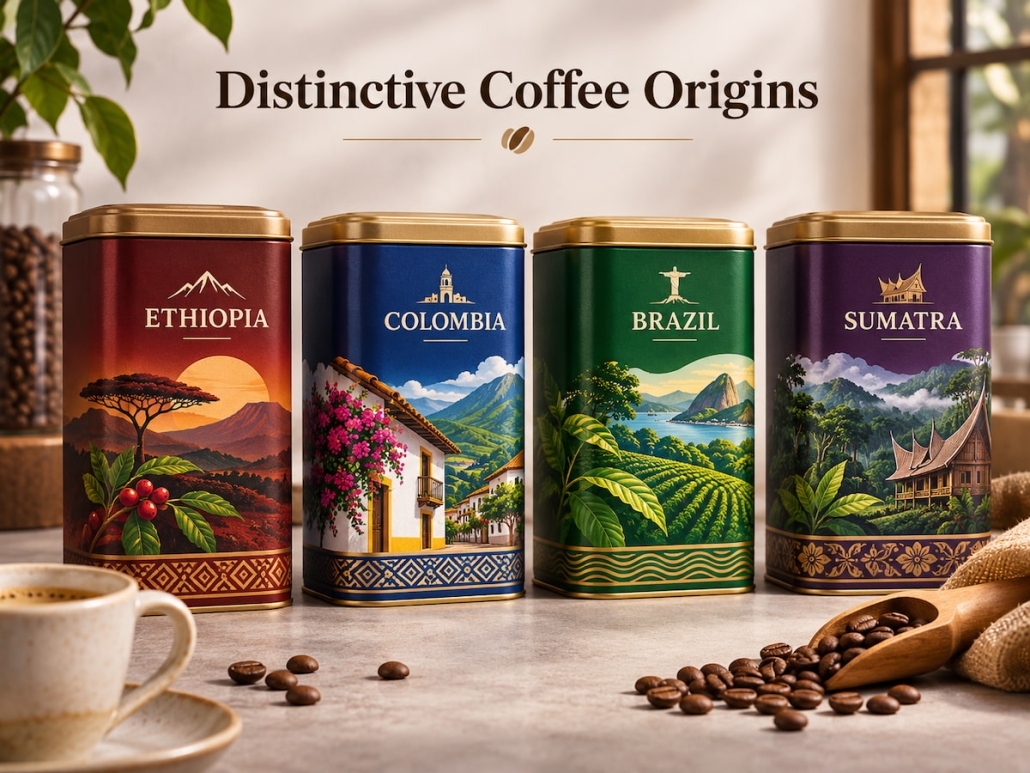
How Can You Create Distinctive Coffee Tin Packaging Using Origin-Specific Color Palettes and Graphics?
Within the same product line, color is one of the quickest ways to distinguish between different coffee origins. However, color schemes shouldn’t be chosen arbitrarily; they should reflect the coffee’s actual attributes and sensory characteristics.
If floral and citrus notes dominate a coffee’s flavor profile, the packaging can feature brighter tones complemented by botanical illustrations; for coffees with chocolate or nutty flavors, deep browns, copper tones, or warm earth tones are ideal.
Graphic elements inspired by the origin can further enhance differentiation:
Geographic graphics: Visually convey the coffee’s origin through the outline of a country or region’s map.
Landscape imagery: Depict mountain ranges, growing regions, or farm environments.
Botanical elements: Use patterns of coffee branches, cherries, or leaves to emphasize its nature as an agricultural product.
Origin information: Include the name of the growing region, farm details, and geographic coordinates to make each product more distinctive.
The key to the design is distinguishing between “decorative inspiration” and an “accurate representation of the origin.” If specific landscape or farm illustrations are used on the packaging cans, they should reflect the actual origin rather than generic visual elements.
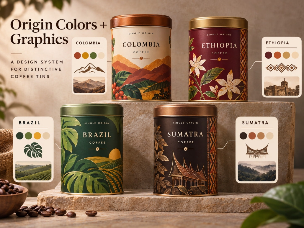
Which elements should remain consistent in coffee tin design?
Although the graphic designs should vary by origin, certain core elements must remain consistent across the entire series to ensure brand recognition.
The brand logo, typography, basic layout, and the overall proportions of the packaging cans should collectively form the visual foundation of the product series. Even when coffee origins differ, consumers should be able to recognize which roaster produced the product instantly.
Packaging design elements can be divided into two categories:
| Consistent Brand Elements | Origin-Specific Elements |
|---|---|
| Brand logo and name | Country and region |
| Primary typography | Origin-specific illustrations |
| Logo position | Color palette |
| Overall layout | Farm or producer information |
| Core brand colors | Tasting notes |
| Tin shape and lid style | Processing and roast information |
TSING can create three coffee tins using the same rectangular can body, lid, and logo placement. Building on this foundation, adjusting the background color, origin illustrations, and product descriptions gives each product a distinct visual appearance.
This approach creates a product line with a unified, recognizable identity without requiring a completely different packaging design for each product.
Creating Distinctive Coffee Tin Packaging with a Unified Metal Structure and Customized Designs
To launch a coffee series featuring beans from multiple origins, you don’t necessarily need to create separate molds for each product. As long as the capacity, filling requirements, and packaging dimensions are compatible, they can share the same structural design with a variety of visual designs.
This is a perfect example of how visual customization and standardized production work in tandem.
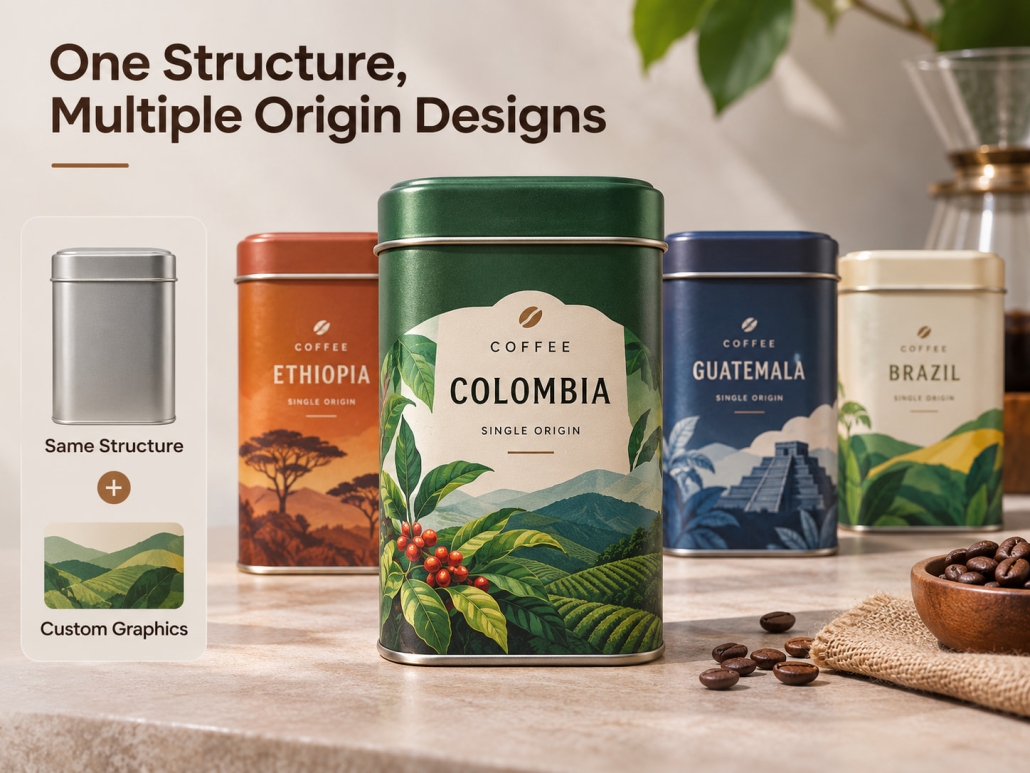
Can Coffee Tins from Different Origins Use the Same Shape and Size?
In many cases, the answer is yes. If coffee products from different origins share the same packaging format and net weight, the tin manufacturer can assess whether a single set of standardized tins and lids can accommodate the entire series.
Adopting a unified structure offers several practical advantages:
- A single set of molds can support multiple product SKUs.
- The specifications of the lids and cans remain consistent.
- Visual designs can be flexibly changed without redesigning the packaging container itself.
- Coordinating packaging inventory management with production planning becomes simpler.
However, identical net weight does not always mean the same internal space requirements. Therefore, before deciding on a unified size, it is necessary to verify the actual filling volume, inner bag dimensions, headspace, and sealing requirements. Customizing special shapes only makes practical sense when product capacity, shelf display requirements, or brand positioning genuinely necessitate different structures.
Adding Personality to Packaging Through Printing and Surface Finishes
With tin can structures standardized, printing has become the primary way to distinguish products from different origins.
TSING can create diverse visual presentations for coffee tins within the same series:
Full-color printing: Used to display origin illustrations, maps, and product information.
Matte and glossy finishes: Create different light-reflecting effects.
Metallic printing: Accents specific areas without covering the entire surface of the tin can.
Embossing: Adds a tactile distinction through raised logos or origin details.
For multi-origin product lines, brands can use a unified design template and swap out the corresponding color schemes, illustrations, and product descriptions by origin. This approach lets brands create custom coffee tins with distinct visual styles without unnecessary structural changes.
Unique Coffee Tin Packaging That Balances Brand Consistency
For multi-origin coffee product lines, the best packaging design maintains a unified structural framework while flexibly adjusting the visual design based on each coffee’s origin.
As a coffee tin manufacturer, we recommend following this process when designing such product lines:
Brand Identity → Origin Information → Color and Graphic System → Unified Can Structure → Custom Design Mockups for Each SKU → Sample Approval → Mass Production of Multiple Products
This approach allows coffee brands to continuously expand their origin-based series without creating separate molds for each product.
 Facebook
 Twitter
 Linkedin
