How Do You Choose the Right Surface Finish for Custom Candle Tins?
Different surface finishes can give candle tins a modern, luxurious, natural, minimalist, festive, or handcrafted look. They also affect the packaging’s resistance to fingerprints, scratches, and shelf wear. When designing custom candle tins, we help clients make selections based on a three-step process: candle formulation, usage scenario, and brand positioning. This is because for candle tins, surface treatments are not merely aesthetic; they also affect heat resistance, scratch resistance, corrosion resistance, print quality, and overall texture.
What Can the Right Surface Treatment Bring to Candle Packaging?
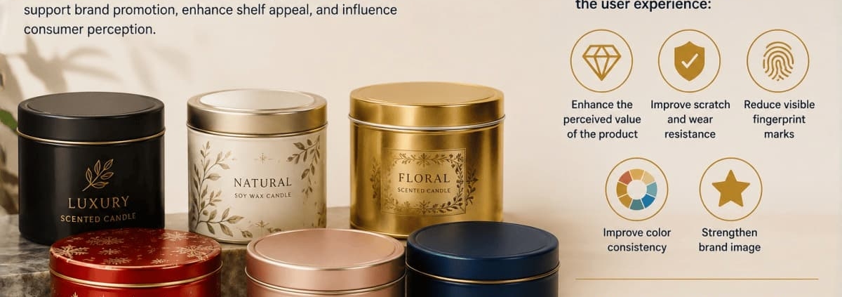
Candle tins serve multiple functions: they protect the candle, support brand promotion, enhance shelf appeal, and influence consumer perception.
The right surface treatment can enhance the following aspects of the user experience:
- Enhance the perceived value of the product
- Improve scratch and wear resistance
- Reduce visible fingerprint marks
- Improve color consistency
- Strengthen brand image
Conversely, an inappropriate choice may result in coating damage, fading, poor durability, or packaging that does not align with the candle’s intended market positioning.
Selecting Surface Finishes for Custom Candle Tins Based on Candle Type
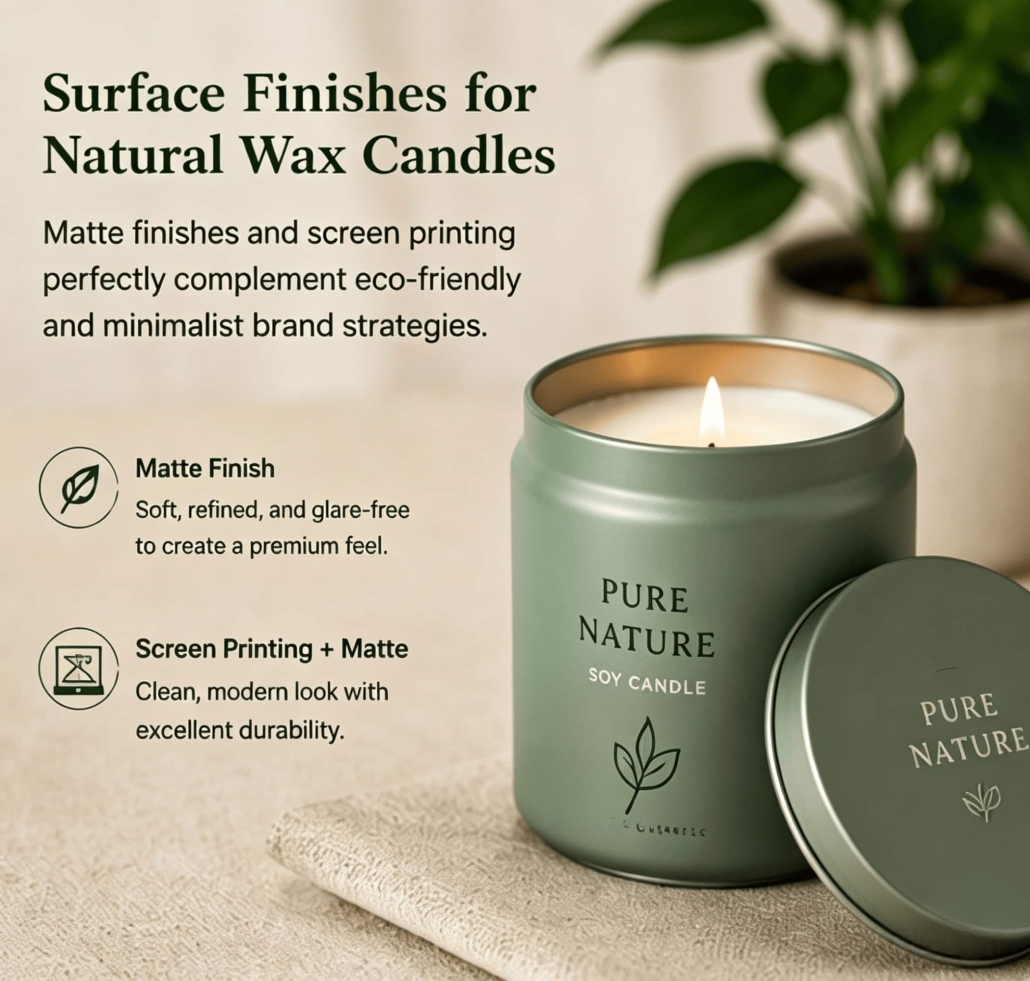
Natural waxes such as soy and coconut are widely used in many yoga studios and are associated with sustainability, healthy living, and a premium home fragrance experience. For these types of products, we typically recommend the following finishes:
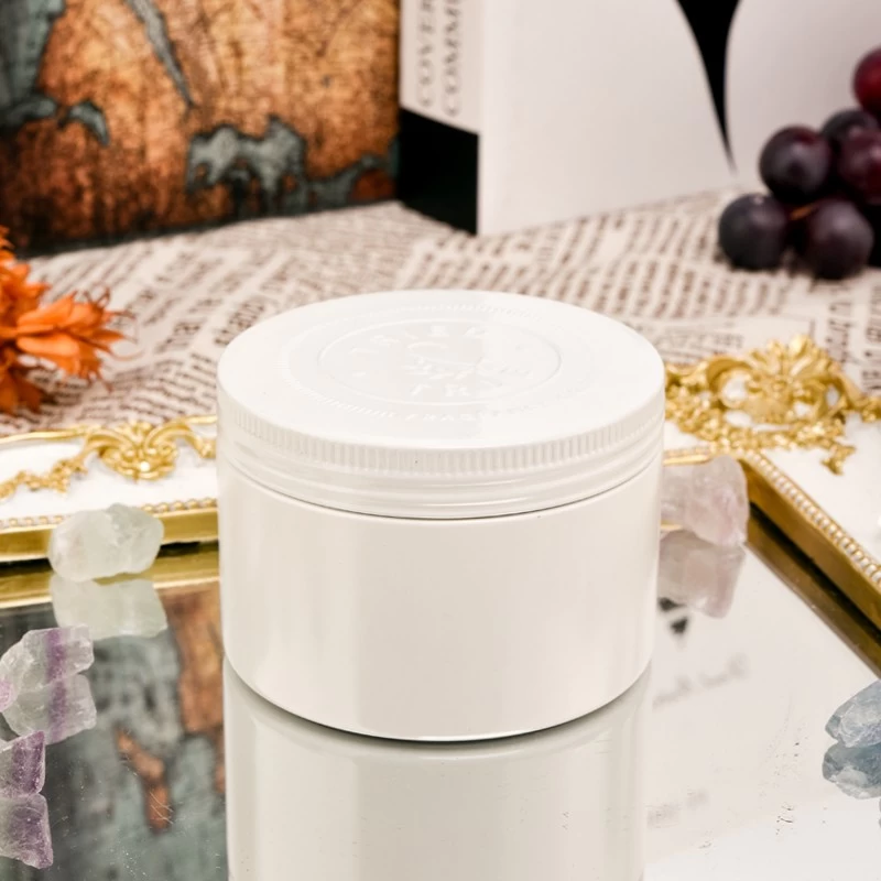
Matte Finish:
A matte finish creates a soft, refined appearance that aligns perfectly with eco-friendly and minimalist brand strategies. Additionally, the matte finish reduces glare and lends the product a premium feel.
Screen Printing Combined with a Matte Finish:
Brands seeking strong visual recognition often combine screen-printed logos with a matte coating. This combination creates a clean, modern aesthetic while ensuring excellent durability.
These techniques work exceptionally well because they complement the natural, understated qualities of soy and coconut wax candles.
Custom Surface Finishing Techniques for Paraffin Candle Tins
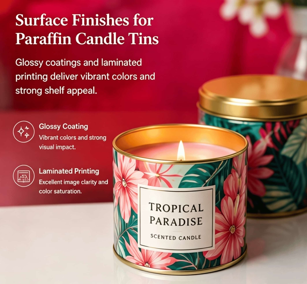
Paraffin candles typically prioritize fragrance diffusion, mass-market appeal, and cost-effectiveness. For these products, suitable processes include:
Glossy Coating:
The glossy finish features vibrant colors and a strong visual impact. This process performs exceptionally well in retail environments where products compete for consumers’ attention.
Laminated Printing:
For brands requiring intricate patterns, seasonal designs, or promotional imagery, laminated printing offers excellent image clarity and color saturation.
These surface-printing techniques enhance the visual appeal of paraffin candles on the shelf while supporting competitive pricing.
Surface Treatment Processes for Candles Containing Essential Oils and High Concentrations of Fragrance
Candles containing high concentrations of essential oils require special consideration. Essential oils and fragrance components may react with certain coatings over time. Therefore, we recommend surface treatment processes that include:
- Highly chemical-resistant coatings
- Industrial-grade baking processes
- Food-grade or solvent-resistant interior coatings
We generally advise clients to avoid using highly vulnerable mirror-finish plating on such products, as the mirror layer is prone to scratches, loss of luster, and localized surface damage over time.
Selecting Surface Finishes for Custom Candle Tins Based on Application Needs
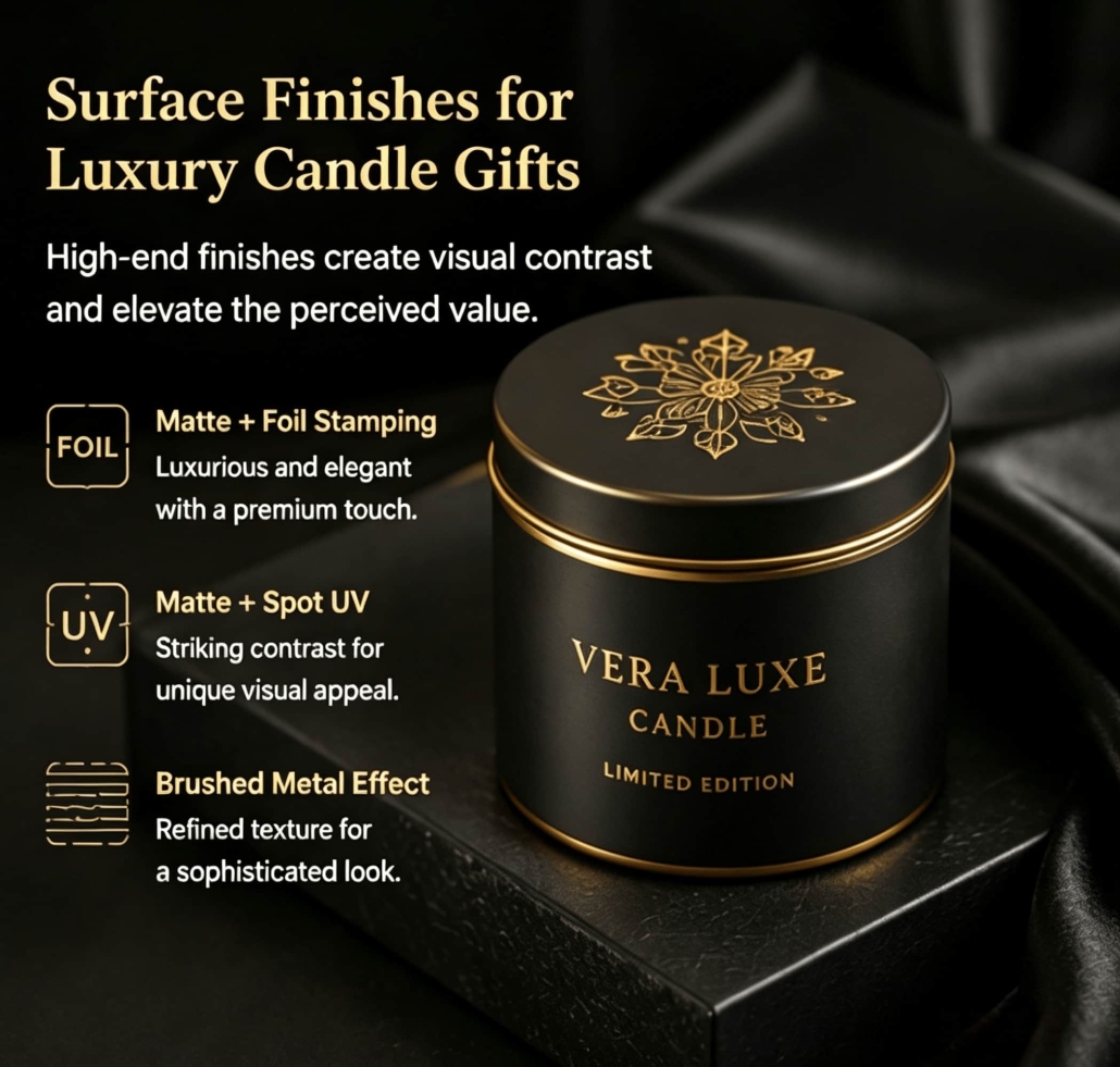
Luxury gifts require packaging that conveys a sense of prestige from the moment it’s opened. Recommended surface finishes include:
- Matte finish with foil stamping
- Matte finish with spot UV coating
- Brushed metal effect
These high-end finishes create striking visual contrasts and enhance the product’s perceived value. Although production costs are higher, they are ideal for holiday collections, limited-edition products, and premium candle gift projects.
Custom Candle Tins for Everyday Consumer Products
For candle products intended for repeat purchases, practicality is often more important than elaborate decoration. Therefore, recommended surface treatments include:
- Minimalist matte coating
- Solid-color printing
- Scratch-resistant protective coating
This approach delivers a clean, uncluttered appearance while ensuring consistent production quality and long-lasting durability.
Candle Tins for Hotels, Spas, and Aromatherapy Brands
Professional fragrance environments prioritize ambiance and visual harmony. For these markets, we typically recommend surface treatments such as:
- Soft matte finish
- Satin texture
- Low-saturation color tones
- Fine-textured coating
These finishes create a serene, refined appearance that complements luxurious hotel and wellness environments.
Selecting the Optimal Surface Treatment for Custom Candle Tins
We never recommend surface treatments based solely on appearance; instead, we make our selections by comprehensively considering the following factors:
- Candle type
- Product positioning
- Budget requirements
- Durability needs
- Regional market preferences
Our design team works closely with clients to ensure every custom candle tin strikes the perfect balance among aesthetics, functionality, durability, and cost-effectiveness. By precisely matching the surface finish to the candle formulation and intended use, brands can maximize user satisfaction.


 Facebook
 Twitter
 Linkedin