
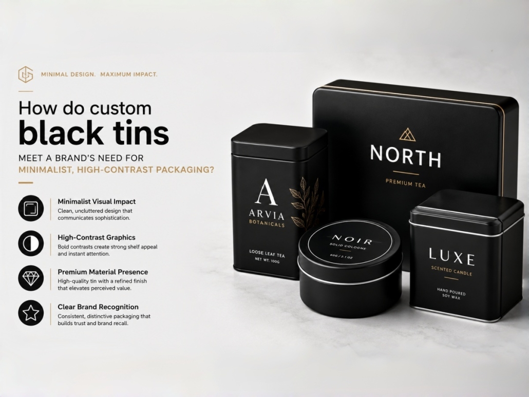
How do custom black tins meet a brand’s need for minimalist, high-contrast packaging?
For brands seeking a clean, high-contrast identity, minimalist packaging should look intentional rather than empty or cheap. Fewer design elements mean consumers pay closer attention to surface quality, print sharpness, container proportions, and the placement of each brand detail. As a professional tin can manufacturer, we consider custom black tins one of the most effective tin packaging options for this design direction. A controlled black surface provides a strong visual foundation, allowing white, silver, gold, or selected accent colors to remain clear and visually dominant.
From a manufacturing perspective, four elements determine whether minimalist black tins look genuinely premium:
- Controlled High-Contrast Printing
- Restrained Premium Surface Finishing
- Precise Structural Geometry
- Concentrated Brand Detailing
When these four elements work together, a simple black tin can build strong brand recognition without complex patterns or excessive decoration.
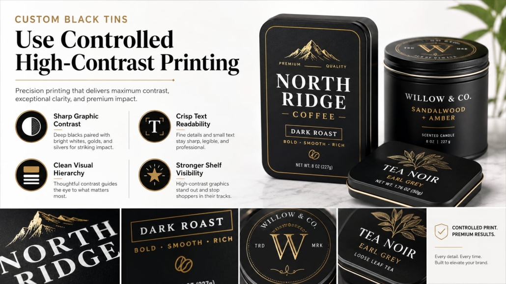
Custom Black Tins Use Controlled High-Contrast Printing
High-contrast packaging starts with a consistent black background. If different parts of the tin appear gray-black, blue-black, or brown-black, the package can already look inconsistent before the logo is printed.
For this reason, TSING controls key variables including:
- Black ink or coating formulation
- Surface coverage
- Ink film consistency
- Base coating
- Drying and curing conditions
- Final matte or gloss level
For multi-piece custom black tins, we also control the visual consistency between the lid, body, and bottom. Once the black base is stable, contrasting graphics can create a clear visual hierarchy.
Custom Black Tins Use White and Metallic Colors as Primary Contrast Elements
White provides the strongest functional contrast against black and works particularly well for:
- Logos
- Product names
- Fine typography
- Minimal line graphics
- Essential product information
However, white ink requires sufficient opacity. If the printed layer is too thin, the black underneath can make white text appear gray, especially when the design uses very fine fonts. Metallic colors offer another effective option when the brand needs a more premium appearance.
Common combinations include:
- Matte black + silver
- Matte black + gold
- Satin black + champagne gold
- Gloss black + silver
Instead of covering a large area with metallic decoration, a small silver or gold logo can become the visual focal point of the entire package. This restrained contrast works especially well for tea tins, candle tins, cosmetic packaging, coffee tins, and premium gift packaging. The key principle is simple: use contrast selectively, not excessively.
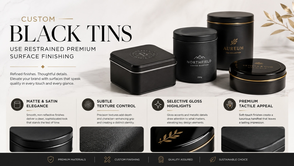
Custom Black Tins Use Restrained Premium Surface Finishing
Minimalist packaging relies more on surface quality because fewer graphics draw attention. For this reason, the black surface must contribute to the packaging’s perceived value.
Use the Finish to Define Brand Character
Different black finishes create different visual impressions.
FinishVisual EffectSuitable Brand Direction:
| Finish | Visual Effect | Suitable Brand Direction |
| Matte black | Low reflection, restrained | Modern premium, luxury |
| Satin black | Soft reflection | Lifestyle, personal care |
| Gloss black | Strong reflection | Bold retail packaging |
| Soft-touch | Tactile, refined | Luxury and gift packaging |
Matte black is one of the most common choices for minimalist packaging because it creates a calm, controlled background. It also works particularly well with metallic graphics because the matte surface absorbs light while the metallic logo reflects it. Satin provides slightly more reflection and creates a softer premium effect, while gloss black offers stronger visual impact in retail environments. For higher-end projects, soft-touch or fine-textured coatings can add tactile depth without adding more visual elements. However, use these finishes selectively.
A typical minimalist combination might be:
Matte black surface + small embossed logo + one metallic accent
This usually creates a stronger premium impression than combining several decorative processes at once. TSING also considers practical performance such as scratch resistance, abrasion resistance, fingerprints, and transportation handling when selecting the surface treatment. Minimalist packaging should remain visually clean not only in the sample room but also after shipping and consumer handling.
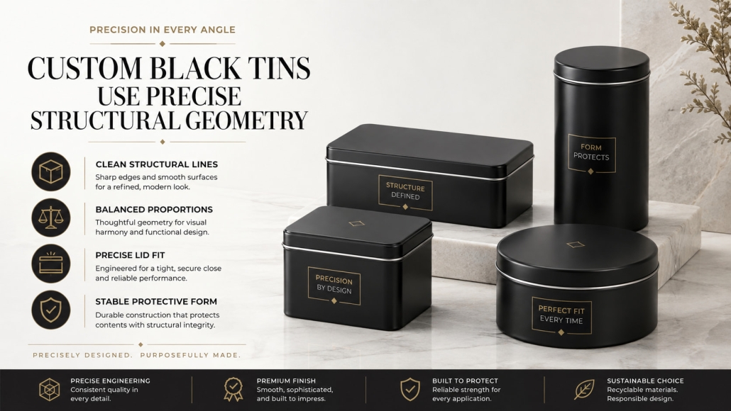
Custom Black Tins Use Precise Structural Geometry
Minimalist packaging does not depend only on graphics. Once decorative elements are reduced, the tin’s physical shape becomes much more visible.
Consumers naturally notice:
- Overall proportions
- Corner radius
- Lid depth
- Panel flatness
- Lid-to-body alignment
- Edge consistency
This makes structural precision especially important for custom black tins.
Custom Black Tins Benefit From Clean, Controlled Shapes
Simple geometric structures often work best for minimalist packaging, including:
- Round tins
- Square tins
- Rectangular tins
- Shallow flat tins
- Straight-sided cylindrical tins
These structures provide clear outlines and keep the logo or typography as the visual focus. Corner radius also influences the packaging’s personality. A smaller radius creates sharper lines and a more technical appearance, while a larger radius creates a softer and more approachable feel. The radius should therefore support the brand identity rather than follow the easiest tooling option.
Require Accurate Lid and Panel Alignment
Minimalist design makes structural defects easier to see. On a highly decorated package, a slight misalignment may be less noticeable. On a plain matte black tin can, the same problem can immediately affect the premium appearance.
We therefore pay particular attention to:
- Lid overlap
- Lid positioning
- Body dimensions
- Edge height
- Closure fit
- Panel alignment
Large flat black panels also require careful forming because waviness, dents, local deformation, and irregular reflections become highly visible, particularly with satin or gloss finishes. Tinplate thickness, forming pressure, tooling accuracy, and trimming quality all influence the final result. In other words, the simpler the graphics, the more important manufacturing precision becomes.
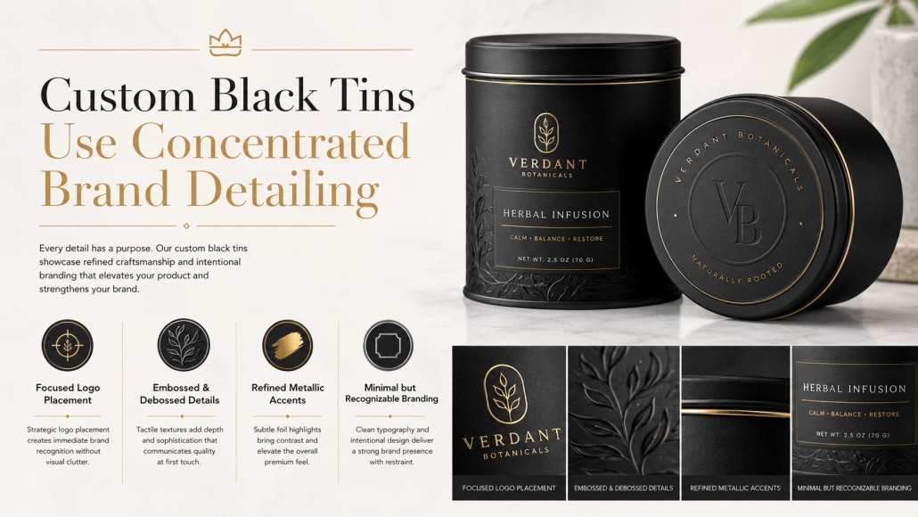
Custom Black Tins Use Concentrated Brand Detailing
Minimalism does not remove brand identity. Instead, it concentrates brand communication into fewer elements.
For the custom black tin, those elements may include:
- One logo
- One product name
- One embossed detail
- One metallic accent
- One secondary color
With fewer competing graphics, each element carries more visual weight.
Custom Black Tins Use Logo Placement and Negative Space Strategically
Logo placement can significantly change the character of minimalist packaging. A centered logo creates symmetry and stability. A smaller logo placed near the edge creates a more contemporary, editorial appearance. A vertically arranged logo can give rectangular black tins a more modern visual direction. Negative space is equally important. A logo doesn’t always need to be larger to stand out. Removing unnecessary graphics around it can often make the logo more dominant.
For example:
1. Design A
- Large logo
- Decorative border
- Illustration
- Multiple messages
- Several colors
2. Design B
- Small silver logo
- Matte black surface
- No decorative border
- Product information moved to the side
Design B can appear more premium because every element has more visual space.
Use Embossing to Add Detail Without Adding More Color
Embossing and debossing are particularly effective for minimalist metal packaging because they create brand detail through the material itself.
Options include:
- Embossed logo
- Debossed typography
- Black-on-black pattern
- Raised border
- Tactile brand symbol
A black-on-black embossed logo can be especially effective. The detail remains subtle from one angle but becomes visible as light moves across the metal surface. This adds depth without introducing another printed color. Secondary information such as ingredients, barcodes, regulatory text, and batch information can then be moved to the side or bottom of the tin. This keeps the primary viewing area visually clean while still carrying all necessary product information.
Custom Black Tins Turn Four Controlled Elements Into a Minimalist Brand System
The effectiveness of custom black tins does not come from black color alone. It comes from controlling four interconnected areas.
Controlled High-Contrast Printing
creates clear visual hierarchy through stable black backgrounds and carefully selected white or metallic graphics.
Restrained Premium Surface Finishing
adds depth, tactile quality, and durability without introducing unnecessary decoration.
Precise Structural Geometry
ensures that clean shapes, aligned lids, flat panels, and balanced proportions support the minimalist concept.
Concentrated Brand Detailing
allows logos, embossing, accent colors, and negative space to communicate brand identity with fewer elements. Together, these four dimensions allow custom black tins to achieve a minimalist, high-contrast appearance without looking monotonous.
 Facebook
 Twitter
 Linkedin
