
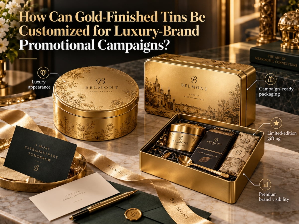
How Can Gold-Finished Tins Be Customized for Luxury-Brand Promotional Campaigns?
Unlike other colors, gold-finished tins convey an extraordinary sense of quality the moment they reach the recipient’s hands—even before they’re opened. However, if the metallic finish is mishandled, the brand logo lacks sufficient contrast, or the surface finish is inconsistent, it can actually undermine the luxurious impression that high-end brands strive to create. Therefore, crafting an exceptional gold-finished tin isn’t as simple as applying a gold layer to the surface; it requires seamless collaboration across substrate processing, logo presentation, decorative details, can structure, and production methods.
When customizing gold-finished tins for luxury brand promotional campaigns, we center our packaging development and design on the target audience, product form, and intended use. With precise control over printing, embossing, surface effects, and prototype validation, we help brands turn promotional concepts into high-end, gold-finished tins that deliver consistent visual quality and exceptional practical performance.
Defining the Visual Effect of Gold-Finished Tins
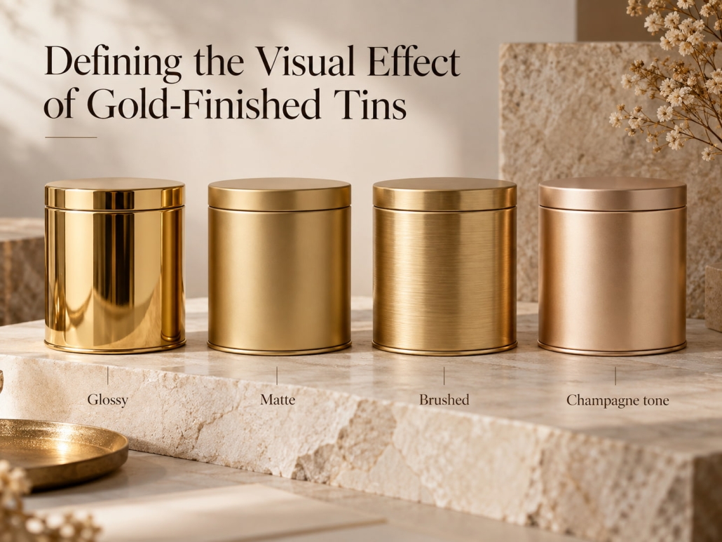
Simply specifying “gold packaging” isn’t enough to set production specifications. Gold tins can read warm or cool, appear bright or subdued, and range from a highly reflective sheen to a nearly satin finish. As a result, placing two metal tins described as “gold” side by side may reveal significant differences in appearance.
TSING begins by clarifying the intended visual direction. By referencing images, brand color guidelines, and existing packaging, we can define the style the brand is pursuing—whether it’s a striking metallic finish, an understated luxury aesthetic, or a more decorative gift-box effect.
Customizable via Shade and Coverage
The shade of gold determines the user’s “first impression” of the product, while the surface finish determines how that gold appears under light.
(Note: The descriptions in this text are for visual direction reference only and do not constitute standardized color specifications. The final appearance depends on the coating or printing process, substrate, and surface treatment used.)
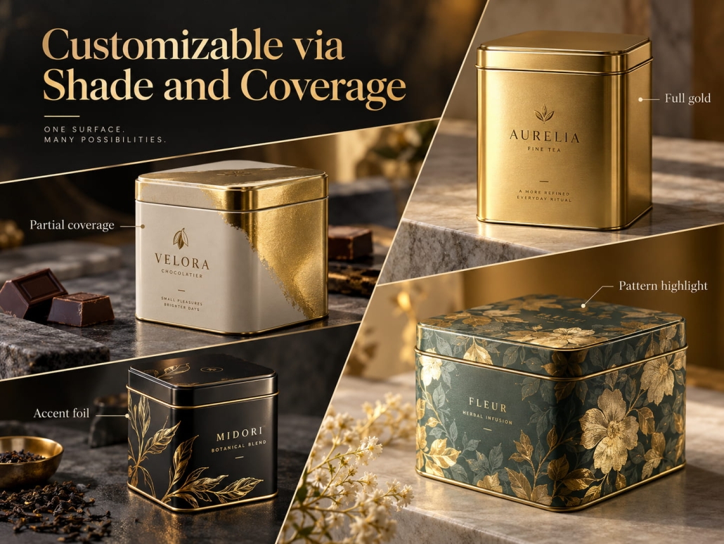
Coverage is another key consideration. If the entire packaging body is gold, it creates a strong and unified visual identity; pairing a gold lid with a contrasting-color can body lends the packaging a more modern style; and using gold as a base color, accented with spot printing, highlights the metallic texture while preserving the brand’s original color scheme.
Based on your specifications, TSING can evaluate options such as gold coating, metallic-effect printing, or direct use of pre-treated gold-colored tinplate. Since different processes yield varying results, we will confirm the selected materials and surface treatments before finalizing the design.
Logo Design on Gold Metal Cans Must Complement the Gold Surface
Against a metallic background, a logo can either become the visual focal point or blur due to the metal’s reflective surface. Therefore, during the design process, it is essential to comprehensively consider the logo’s color, size, placement, and production technique. Deep navy blue, black, and dark brown typically create strong contrast with gold surfaces; white can create a cleaner, brighter effect; and brand-specific colors help maintain brand recognition while keeping the logo clearly distinguishable against the background.
The logo’s production process offers even greater customization options.
Printing suits intricate patterns, small text, and multicolored brand logos; embossing adds a three-dimensional effect and tactile texture, while debossing creates recessed details. Additionally, contrasting glossy and matte finishes in specific areas can highlight the logo without adding extra colors.
Take, for example, a metal promotional can for a luxury brand featuring a central logo:
If the logo is embossed, the surrounding printed patterns should complement the embossing rather than overshadow it. At the same time, the embossing depth, line thickness, and distance from the lid’s edge must align with the tinplate material’s characteristics and the forming process’s requirements.
For luxury brand gold metal tins, the most effective design strategy is to establish a core brand element and let other decorative elements support and complement it.
Using Structural and Decorative Details to Impart a Specific Marketing Theme to Gold-Finished Tins
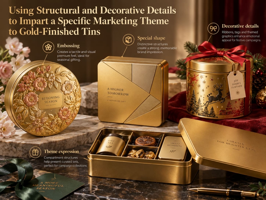
High-end promotional metal tins should let consumers instantly recognize the marketing campaign they represent, not as ordinary gold-colored tins. This distinctiveness stems from the clever combination of the gold finish with the packaging’s shape, proportions, opening experience, and carefully selected decorative details.
Integrating Unique Shapes, Decorative Details, and Marketing Theme Elements
The container’s shape determines how well it conveys the brand’s essence.
Flat, rectangular metal tins offer a wide lid surface, ideal for displaying the core brand logo or marketing theme graphics; round metal tins create a distinct visual silhouette; and taller rectangular cans provide more space for vertical visual elements. Hinged lids, removable lids, and uniquely shaped containers also influence how the recipient interacts with the gift.
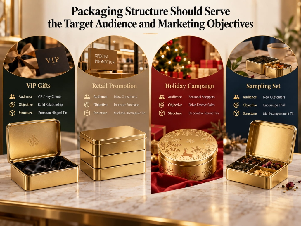
Packaging Structure Should Serve the Target Audience and Marketing Objectives
For example, for a limited-edition chocolate marketing campaign, we could design a wide, flat champagne-gold metal tin with a subtle embossed logo and printed graphics limited to the lid. In corporate gifting projects, however, a more subdued gold tin with a high-contrast brand logo might be more appropriate, since this packaging needs to appeal to a different audience and accurately convey the brand image.
Decorative techniques include metallic-effect printing, spot varnish, embossed borders, color contrast between the lid and tin body, and patterns designed for specific marketing campaigns. Don’t add these decorative elements haphazardly; each should serve a clear purpose in the visual hierarchy.
When customizing gold promotional metal tins, we can plan around the following four dimensions:
1. Brand Recognition: Which brand identifiers or logos need to be immediately visible?
2. Marketing Distinctiveness: How does this version differ from standard packaging?
3. Visual Hierarchy: Which areas should serve as visual focal points, and which should remain understated and subtle?
4. Reusability: After the promotional product is removed, can the metal tin still be used as an attractive storage container?
This last point matters most; durable decorative finishes and a thoughtfully designed opening experience ensure the brand’s influence endures long after the gift is given.
Physical Samples Take Precedence Over Design Drafts
While digital renderings can illustrate the layout, they cannot fully replicate the reflective texture of gold metal, the tactile quality of embossing, or how the metal looks after forming under different lighting conditions.
Therefore, before officially commencing mass production, we will first verify the physical sample. This sample should reproduce the intended materials, gold finish, printing effects, decorative details, and the final container structure as accurately as possible.
During the evaluation, we will focus on the following three aspects:
1. Is the gold finish satisfactory?
2. How do the brand elements appear on the physical tin box?
3. Is the design feasible for stable mass production?
These checks are especially important when the design combines embossing and printing or uses multiple gold finishes. A design that looks attractive on a flat sheet may change in appearance after forming. Once the sample is approved, document the gold finish, design version, decorative details, and acceptance criteria as the production basis.
Creating High-End, Luxurious Gold Tins for Luxury Brand Campaigns
So, how do you customize gold-finished tins for luxury brand campaigns?
First, define the specific gold finish; second, align the logo and decorative techniques with the container’s shape and intended use; finally, verify the visual concept with physical samples to ensure it reproduces reliably.
Therefore, our goal is not merely to manufacture a gold-finished tin box, but to create a gold-finished tin can that embodies a distinctive brand image for the campaign, features a precisely controlled metallic texture, and incorporates decorative details compatible with the production process.
 Facebook
 Twitter
 Linkedin

